
These are the formatting requirements for manuscripts submitted to JANES. Getting this right on your end saves a significant amount of back-and-forth — and reduces the chance that something in your article gets changed unintentionally during production.
General Manuscript Preparation
Prepare your manuscript in Microsoft Word. Do not use InDesign, Pages, or other page-layout software. All accepted articles go through a formatting pass before publication — heavy custom formatting in your source file gets in the way of that and will be stripped out.
Page size is US Letter (8.5 × 11 inches) with 1-inch top and bottom margins and 1.5-inch left and right margins. Body text is Times New Roman 12pt, fully justified, 1.5× line spacing. No extra blank lines between body paragraphs — one paragraph return between each.
Margins and spacing
Do not adjust the page margins, paper size, or line spacing. These are standardized during production. If you are working from a previous submission's template, check that the margins still match the specs above.
Title, Author, and Affiliation
The first three paragraphs of your document should be, in order: your article title, your full name, and your institutional affiliation. Each on its own paragraph — no blank lines between them, and no soft returns (Shift+Enter) to combine any two into one.
All three should be centered. The production script sets the sizes automatically, but use roughly these sizes in your draft so the layout looks right during review: title 16pt bold, author name 14pt, affiliation 12pt.
Title block format
Title:        centered, 16pt bold, Times New Roman
Author name:  centered, 14pt, Times New Roman
Affiliation:  centered, 12pt, Times New Roman
Example:
Kingship and the Storm-God in the Tell Ashqar Inscriptions
Institute for Ancient Near Eastern Studies, Carrow University
Body Text
Body text is Times New Roman 12pt, fully justified, 1.5× line spacing. The first paragraph after the title block — and the first paragraph after any section heading — is flush left, no indent. All other body paragraphs have a 0.5-inch first-line indent. Set that indent in Word’s paragraph settings, not with the space bar or a tab character.
No blank lines between body paragraphs. One paragraph return (Enter). If you want visual separation between major sections, use a section heading — not extra blank lines.
Common body-text problems to avoid
- Using the Tab key or spaces to indent (use Word's paragraph indent instead)
- Typing a Tab at the start of a paragraph that already has a first-line indent — this doubles the indent and every such paragraph has to be fixed by hand in production
- Inserting blank lines between paragraphs
- Using double paragraph returns after headings
- Setting body text in a font other than Times New Roman
- Using single line spacing or double line spacing instead of 1.5×
Section Headings
JANES does not use Word’s built-in Heading styles (Heading 1, Heading 2, etc.). A section heading is just a regular body paragraph with its text set to bold. No larger font size, no different font, no automatic numbering.
Section headings are flush left, bold, Times New Roman 12pt, no first-line indent. The first body paragraph after a heading is also flush left. Subsequent paragraphs in that section get the standard 0.5-inch indent.
Section heading style
Correct: A plain paragraph whose text is set to bold.
Incorrect: A paragraph formatted with Word's Heading 1 or Heading 2
style.
To check: right-click the heading paragraph in Word and choose “Paragraph” — the style should read “Normal” or “Body”, not “Heading 1”.
Example:
The Storm-God Motif
The first paragraph after a heading is flush left, with no first-line indent, exactly as it appears here.
Every subsequent paragraph in the section takes the standard half-inch first-line indent, like this one.
Footnotes and Citations
JANES uses footnotes, not endnotes. Insert them via Word’s footnote tool (References → Insert Footnote) — do not type note numbers manually, and do not convert your notes to endnotes before submitting. Footnote text should be Times New Roman 10pt.
Every paragraph inside a footnote must use Word’s built-in “Footnote Text” style. If you paste material into a footnote from the body or from another document, Word will often paste it in “Normal” style — which silently adds extra space after the note and produces a blank gap between notes that cannot be deleted with the Backspace key. If you see an unexplained blank line between two footnotes, click in the note above it and check the style box: it should read “Footnote Text”, not “Normal”. Do not add empty paragraphs inside or after a footnote.
Phantom blank lines between footnotes
A blank line between two footnotes that you cannot delete is almost always a footnote paragraph in the wrong style. Fix: select the footnote text and apply the “Footnote Text” style.
JANES uses SBL citation style. Full details are in the SBL Handbook of Style, 2nd edition. The most common forms:
Citation examples (SBL style)
First citation of a monograph
Eleanor R. Brandt, Myth and Monarchy in the Northern Levant (Chicago: Ambrose University Press, 1991), 112.
Subsequent citation
Brandt, Myth and Monarchy, 115.
Journal article
Samuel D. Okonkwo, “Administrative Formulae in the Tell Ashqar Archive,” JLE 12 (2019): 55–78.
Edited volume
Ruth Alderman, ed., Proceedings of the Carrow Symposium on Semitic Epigraphy, ANES Studies 8 (Leiden: Meridian, 2004).
Chapter in an edited volume
Tomás Vega, “Scribal Conventions in the Ashqar Corpus,” in Reading Ancient Archives, ed. Ruth Alderman and Peter Nkemelu (Boston: Ambrose University Press, 2010), 215–36.
Use en dashes (–) for page ranges, not hyphens (-). Use real em dashes (—) for parenthetical dashes — never two hyphens (–), which do not convert automatically and have to be found and replaced one at a time. Use ibid. (not italicized) for a reference that is the same as the immediately preceding note. Abbreviations for journals and series should follow the SBL Handbook of Style abbreviations list.
Hebrew, Greek, and Other Scripts
All non-Latin scripts must be Unicode-encoded. Do not use legacy font systems where Hebrew or Greek characters are mapped to Latin code points — these look fine on screen but break in production. Fonts are normalized to the SBL faces in production, but the characters themselves have to be real Unicode to begin with.
For Hebrew and Aramaic, use SBL Hebrew or SBL BibLit — the two share the same Hebrew letterforms, so either is fine. For ancient Greek, use SBL Greek or SBL BibLit, which likewise share their Greek letterforms. (SBL BibLit combines the Latin, Greek, and Hebrew faces in one font, convenient if your article mixes scripts.) All are freely available from the SBL website. Apply the font to the whole run of script text, including any vowel points and accents — and apply it in the footnotes as well as the body. Hebrew left at the document’s default font is the single most common correction we have to make.
Acceptable script fonts
House script fonts — use either, they render identically:
Hebrew / Aramaic: SBL Hebrew or SBL BibLit
Greek: SBL Greek or SBL BibLit
Also acceptable in submissions (will be normalized):
Hebrew — Ezra SIL, Ezra SIL SR
Greek — Gentium Plus, New Athena Unicode
Fonts to avoid (legacy, non-Unicode): SPTiberian, SPIonic, Sgreek, and any font that requires a custom keyboard layout that types Hebrew or Greek as Latin letters.
A note on line spacing: because the SBL script fonts are taller than Times New Roman, a line containing even one Hebrew word may look more widely spaced than its neighbors in your draft. Leave it alone. Production sets fixed line heights that eliminate the effect; anything you add to compensate (smaller font sizes, manual spacing changes, extra returns) has to be undone by hand.
Two examples of correctly encoded Hebrew in body text:
- The inscription opens with the clause רָעַם הָאֵל בַּשָּׁמַיִם (“the god thundered in the heavens”), establishing the storm-god motif at the outset.
- The key term מַס (“levy” or “tribute”) recurs throughout the administrative section of the text.
Word handles right-to-left directionality automatically when the characters are properly encoded. Do not insert RTL or LTR override characters (U+200F, U+200E) manually.
Transliteration
For transliteration of Hebrew, Aramaic, and other Semitic languages, follow the SBL Handbook of Style tables (Appendix E), full academic scheme. The simplified scheme is acceptable if you have a reason for it, but the full scheme is the default. All diacritics should be Unicode characters (e.g., ṭ = U+1E6D, ṣ = U+1E63, ḥ = U+1E25) — do not simulate them with manually composed combining characters.
Transliteration characters
Commonly needed transliteration characters and their Unicode code points: ā (U+0101) ē (U+0113) ī (U+012B) ō (U+014D) ū (U+016B) ḥ (U+1E25) ṭ (U+1E6D) ṣ (U+1E63) š (U+0161) ḵ (U+1E35) ḏ (U+1E0F) ṯ (U+1E6F) ġ (U+0121) ẓ (U+1E93)
These characters are available in most Unicode fonts including Times New Roman. Use Word's Insert Symbol dialog (Insert → Symbol → More Symbols) or copy from a Unicode character table.
Lists
Use Word’s list tools (Home → Bullets / Numbering) for every list — never type the numbers, letters, or bullet characters yourself. House style: bulleted lists for enumerations whose order carries no meaning (including lists of labeled points or sub-headings), numbered lists only where the numbers are referred to in the text (“see item 12 above”).
If one numbered sequence runs through your article with prose paragraphs or sub-headings between the items, make sure every item belongs to the same Word list, so the numbering continues automatically (right-click → “Continue Numbering” if an item restarts at 1). Do not fix a wrong number by typing over it — the underlying list will still be wrong and the numbering will shift again in production.
List formatting
List problems that required extensive manual correction in a recent volume:
- Numbered items that restarted at 1 after each sub-heading
- Roman-numeral and lettered lists where house style calls for bullets
- Continuation paragraphs under a list item given a hanging indent instead of a plain left indent matching the item's text
For a paragraph that continues a bulleted/numbered item (for example a quoted verse under the item), remove it from the list and set a plain left indent equal to the item's text indent — no hanging indent, no first-line indent.
Block Quotations
Quotations of four or more lines go in a block quotation: indented 0.5 inches from both margins, no first-line indent, same font and size as body text. No quotation marks around block quotations.
Example:
The storm-god went before the king and opened the passes of the mountain; the waters heard his voice and drew back. In that day the throne was made firm, and the land brought its tribute and did not complain. (Tell Ashqar Stele, lines 12–15)
To apply in Word: select the paragraph, open the Paragraph dialog, set left indent = 0.5" and right indent = 0.5", no first-line indent. The List Indent or Quote styles are fine if they produce exactly that result — check the indent values before assuming they do.
Tables
Use Word’s built-in table tool (Insert → Table). Tables built with tabs, spaces, or text boxes don’t survive the formatting pass. Each table needs a numbered caption above it, e.g., “Table 1. Attestations of the root MSS in the Tell Ashqar corpus.” Captions are Times New Roman 12pt, flush left.
Table text can be 10pt or 11pt to fit the text block, Times New Roman. Keep borders simple: rules at the top, bottom, and below the header row are enough. Skip the colored cell backgrounds.
Table 1. Attestations of the root MSS in the Tell Ashqar corpus.
| Line | Form | Gloss |
|---|---|---|
| 3 | ymss | “it dissolves” |
| 7 | nmss | “we melt away” |
| 14 | mss | “levy, forced labor” |
Tables with script content
Tables containing Hebrew or Greek text should use the same Unicode fonts as body text. The font-normalization script will process table cells as well as body paragraphs.
Figures and Images
Embed figures (photographs, maps, drawings, charts) in the Word file at their intended location, and also submit them as separate high-resolution files (minimum 300 dpi; TIFF or EPS preferred, JPEG acceptable). Each figure gets a numbered caption below it, e.g., “Figure 1. Basalt stele fragment from the Tell Ashqar excavation, Area D.”
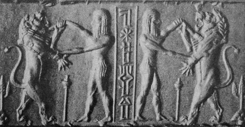
Figure 1. Basalt stele fragment from the Tell Ashqar excavation, Area D.
You are responsible for obtaining permission for any copyrighted images. Include the permission statement in the figure caption.
Abstract and Keywords
Include an abstract of 100–200 words immediately after the title block, before the article body. Format it as a regular body paragraph, flush left — no heading label above it.
After the abstract, list 4–6 keywords separated by semicolons, preceded by “Keywords:” in bold. For example: Keywords: Tell Ashqar inscriptions; storm-god; royal legitimacy; West Semitic epigraphy; divine warrior.
Submission Checklist
Check each item before you send. Manuscripts that miss these requirements will be returned before going to editorial review.
- File is in Microsoft Word format (.docx)
- Title, author name, and affiliation are in the first three paragraphs, each centered and on its own paragraph
- Body text is Times New Roman 12pt, fully justified, 1.5× line spacing
- Section headings are bold body paragraphs — not Word Heading styles
- All notes are footnotes (not endnotes), inserted via Word's footnote tool
- All footnote paragraphs use the “Footnote Text” style — no “Normal”-styled paragraphs or blank paragraphs inside footnotes
- Citation style follows SBL Handbook of Style (2nd ed.)
- En dashes for page ranges; real em dashes (—), never double hyphens (--)
- All Hebrew, Aramaic, and Greek text is encoded in Unicode
- Hebrew/Aramaic is in SBL Hebrew or SBL BibLit; Greek is in SBL Greek or SBL BibLit (or an approved equivalent) — in footnotes as well as body
- No legacy font-encoded Hebrew or Greek (SPTiberian, SPIonic, etc.)
- Lists use Word's bullet/numbering tools; numbered sequences continue correctly across intervening paragraphs
- No Tab characters at the start of paragraphs (no doubled indents)
- Transliteration uses Unicode diacritic characters, not manually composed characters
- Block quotations (4+ lines) are indented 0.5" left and right, no first-line indent, no quotation marks
- Tables created with Word's table tool, not with tabs or spaces; captions above each table
- Figures embedded in document and provided as separate high-resolution files; captions below each figure
- Image permissions documented in captions where required
- Abstract (100–200 words) and keywords (4–6, semicolon-separated) included before body text
- Page margins are not manually adjusted (production will standardize)
- No extra blank lines between paragraphs
Contact
For questions about submission or style, contact the editor, Prof. Shalom E. Holtz, at sholtz@yu.edu. Technical production questions can go to the Technical Consultant.